UNIT: Petra Ivašková, UX Designer, Sandbox Design Dept.
TO: Arma 3 Dev-Branch Users
OPSUM: Evaluating an overhaul of the Respawn Screen

Alongside the ongoing spree of overhauls improving the User eXperience on the #RoadToApex , I would like to welcome you to an OPREP introducing the overhaul of the Respawn Screen and also my very first report.
RESPAWNING READER ...
Being shot and thrown into the Respawn Screen is a game stopper. Being able to choose your gear and where to respawn clearly and back in-game fast is essential. As you may have already seen on Dev-Branch, the screen started to look a little bit different a while ago.
Besides major changes to the layout itself, the underlying base of scripts is being modified too. This is not only to remove certain limitations of the old system, but to allow us to bring in a few new features. What is happening to our good old Respawn Screen then? The following lines will reveal everything behind the new respawn system from both a visual and functional perspective.
USER INTERFACE
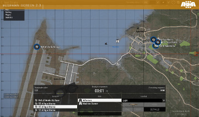
Aside from the new content for Apex that is being crafted, we are also focused on multiplayer systems to support our upcoming co-op campaign and to improve the multipayer gameplay more broadly. Without any doubt, the Respawn Screen is an inseparable part. With a vision of making the whole screen easier to use we started by decomposing the big and slightly cumbersome carousel dialog into something more compact.
The next step was to accommodate the full screen map as a primary navigation tool for position selection. All information is now laid out in a single panel allowing you to see clearly where and what loadout you are respawning with when the time is up.
Speaking of remaining time, this is one of the most prominent elements on the screen now. In case you don't want to hypnotize the seconds to run faster and wait impatiently until they turn into a big button to click on, just enable the option to respawn automatically when the countdown ends. Meanwhile this seems-to-be-never-ending waiting, you can still experience the ongoing battle via an improved Spectator mode that was introduced during the End Game Tournament .
ROLE SELECTION
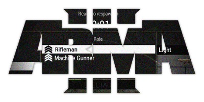
One of the most significant changes is the role selection. On the previous Respawn Screen, the loadout itself determined both the role and the equipment. To make it more versatile and easier to navigate through, we've brought a new layer above the loadouts by sorting them into roles. This move for example lets two players play as a marksman but have a different type of rifle equipped.
Also, the resulting function of a player after his or her respawn is more clear regardless of the chosen loadout. To prevent a situation where you are suddenly playing in a group composed solely of medics after a first round of respawns, scenario designers can limit the number of players for a given role.
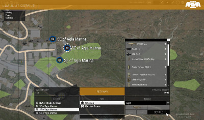
Furthermore, they can create custom roles and loadouts. The loadout preview is condensed to represent only the most important items, namely primary weapon (including optics), launcher and special items (medkit, toolkit, UAV terminal) while you can still see the rest of inventory on demand.
CUSTOMIZATION AND DOCUMENTATION
We are aware of the enormous number and variability of user-created scenarios and we understand this screen might not be suitable for every single one of them. As this new solution replaces the old one, it still remains scripted. Therefore, it is under full control of designers and can be customized to fulfill the specific needs of the scenario, or it doesn't have to be used at all. The same applies to spectating functionality. Documentation is ready for you on our Community Wiki.
In this overhaul, we've aimed for an easier to use layout while providing space for bigger features like roles or the spectator camera, and even for tiny enhancements like automatic respawn and more apparent location icons on the map. Moreover, the new respawn system should be simpler to extend as UI elements are more separated from the functional layer.
We are always eager to hear your any feedback, ideas and issues you might experience! The best place for that is our forum , where you can already find some technical details and comments and I want to thank you for that.
Happy respawning!
Petra Ivašková
UX Designer, Sandbox Design Dept.


