UNIT: Pavel Guglava, Senior Artist, Art Dept.
TO: Arma 3 Dev-Branch Users
OPSUM: Introducing splendid upgrades to Arma 3's lighting and visuals.

With the aim of pushing authenticity one step further, we have decided to upgrade the visual fidelity of Arma 3's terrains. Although you are going to see the difference on first sight (available right now on Dev-Branch, and currently pencilled in - for everyone, for free - in Update 1.60, on the #RoadToApex), technology-wise, there is a lot going on under the new and vivid hood, which we'd like to share with our community.
In particular, we'd like to discuss some of the specific changes to lighting / HDR settings, tone mapping, clouds, sea shader and our brand new reflections tech. Maybe even more importantly, we also want to share some of the new options available to our community to set up their game, and provide tips for our talented modders about what tweaks they may need to make to make their own creations look just as splendid.
But, before we dig into the details, let's take a look at our underlying motivations, and answer the question: why did we make such a change?
ROAD TO APEX
There are many reasons for the changes, but our main goal was to maintain a high quality of the whole game and being prepared for the release of Arma 3 Apex. The lush archipelago of Tanoa would stand out compared to the relatively muted landscape of The Republic of Altis & Stratis, and even assets that were great on older islands would not fit in. We didn't want any artificial coloration of scenes for story purposes alone; rather, we decided to bring the whole game closer to real life.
With the help of references we gathered for our terrains, another goal was to make the game more photo-realistic, which was previously possible only with post-processes. More in depth, if you looked into details of color scale in the game, you might have noticed a distinctive red tint - we decided to make the scale broader and more balanced.
UNDER THE HOOD
The primary change is a new setting of lighting conditions and improved way that our High Dynamic Range (HDR) tech handles light in the scene. This required a ton of tweaks to both materials and textures of all vegetation, buildings and even surfaces of the islands.
Added to that, we have even taken a closer look on the sea with new surface reflections (as you may have seen in our Tanoa reveal), and we went up to the sky to adjust clouds to be more authentic than ever. Not to mention, we have adjusted the rainbow, don't forget about the rainbow. Click below for more Splendid™ details!
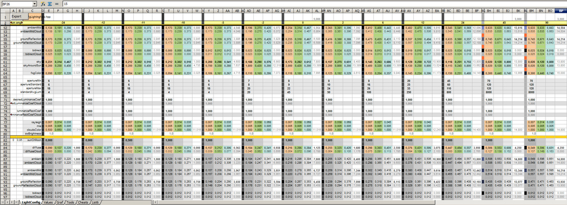
There are several key elements of the update, one of them is obviously the tone mapping used in the whole game. We have adjusted our HDR technology to provide a natural contrast and saturation for the game scene. We had to adjust the light setting accordingly, which required several iterations, but the new light and aperture configuration should now work correctly with the technology. You may see the biggest difference at night, but even dusk and dawn should look much better now.
Add a new setting for clouds to the mix and you are going to end with a romantic sunrise! The clouds are now properly affected by the light conditions and their shape should feel more natural. We had to add several more steps for both day light settings and various weather conditions, the number of sets multiplied four-times.
What's the best place to enjoy a sunset? Obviously a sea shore. We have adjusted that too, and a new water shader. This should fit well into the adjustments to the underwater light setup and even the shore itself should look better thanks to an extended wet surface at shorelines and enhanced water foam. These may seem like minor adjustments, but attention to details should make the game feel more authentic.
'Screen Space Reflections' is a new technology that makes Arma 3's water more realistic. Reflections are used at the water surface only for now; thanks to that, you can see your boat or a submarine in the reflection of the water surface.
POWER TO THE PEOPLE
As we were experimenting with various values for textures, materials, saturation, contrast and brightness, it resulted in advanced options how to set up the game. The update comes with new ways to configure the visual part in game options, which means everyone can set the contrast levels according to their taste.
And the good news for all community creators, there may be some minor flaws more evident on your materials, but generally speaking, there should be next to no work required on models already released. We have tried to adjust the light conditions to provide a soft transition between old and new lightning. For any tweaks that are necessary, we plan to publish a small guide before the upgrade reaches everyone in Update 1.60.
AIN'T IT PURDY?
Apparently there's a great exchange rate on pictures-to-words; so here's some commission-free comparison snaps of the previous and current state:
After a year-long development, our Visual Upgrade is finally ready for its first unveiling; now, we're moving into a phase of tweaking and optimising. Speaking of which, in terms of performance, the new lighting configuration itself should have have no impact; however, terrains with a lot of shoreline may be slightly impacted, due to the new approach to rendering water on the coast. Although we expect the new Screen Space Reflections tech will be more demanding, there is an option for players to disable this.
We'll provide more details about this in a future SITREP; meanwhile, feel free to share your thoughts about the current state. We are looking forward to read them on our forums. Keep in mind that there's still more to do, and we are going to do our best to release this upgrade in the best possible state in Update 1.60.
Have fun trying it on Dev-Branch meanwhile - see you on the beach!


